Introduction:
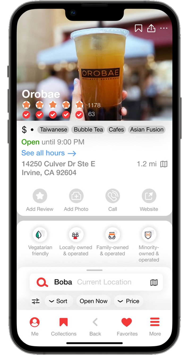
Yelp’s current app design provides many options and information but quickly becomes cluttered and hard to understand at a glance. The design often makes understanding information at a quick glance difficult, making it overwhelming for a first time user or visitor. By clarifying the heirarchy of important information and features, user can process the information with more ease.
My Role: Design Lead
People Involved: Randy Wu
My Role: Design Lead
People Involved: Randy Wu
Skills:
Market Research
Design
Prototyping
Market Research
Design
Prototyping
Tools:
Adobe Illustrator
Figma
Adobe Illustrator
Figma
Problem:
Yelp’s current layout is a bit too cluttered and does not make a simple search easy.
Goal:
Streamline the presentation of information and optimize the layout of App to promote user engagement and increase usage.
Research:
Based on a public survey of adults, 93% of people on Yelp compare businesses before making a decision. When searching for a local business, people on Yelp reported finding value in information beyond reviews and ratings:
75% valued seeing that a business has a business or trade license
71% valued the ability to request a price estimate online
69% valued seeing pictures and costs of completed projects
58% valued knowing about unique characteristics, such as being open late or being family-owned
By establishing the most important information that users look for first, at a glance comparisons become much more easy.

Process:
Two ratings are used to display the rating of a resturant, similar to rotten tomatoes with a critic rating and user rating. But instead of critic and user rating, there is the normal rating from all users and then a “critic” rating that has a weighted rating that takes into account the users’ rating history and their frequency visiting the establishment. Users with frequent negative ratings will be flag and be put under review. User’s rating that are highly rated as “useful” by other users will appear much higher on the review listings by default and for every buisness the top rated useful review will be featured more bodly to give some quick insight on the buisness. This way the critic rating will have only useful and accurate reviews from frequent customers that prevents revewing bombing or an outlier experience to weigh as much as a review from a person that frequents the establishment.
![]()
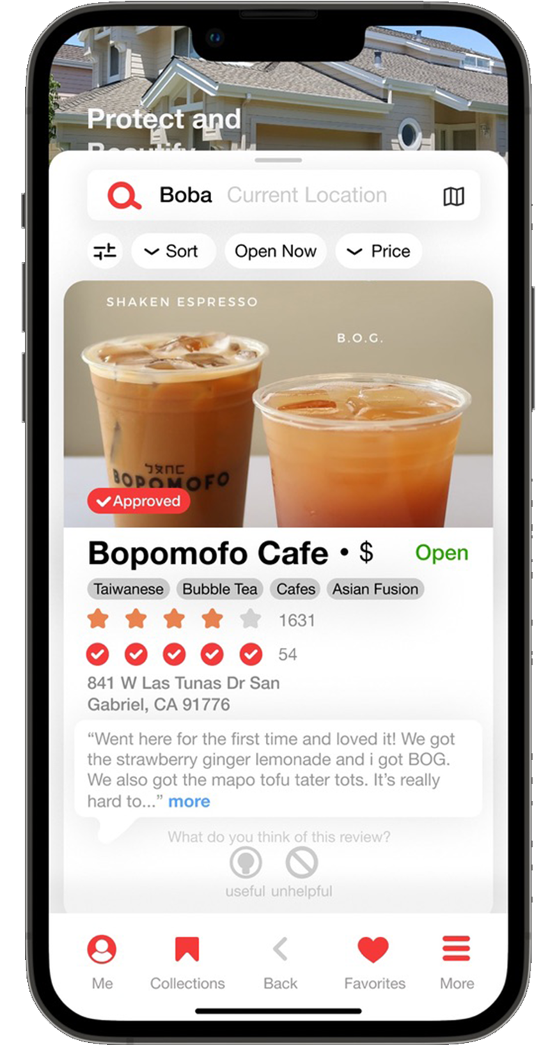
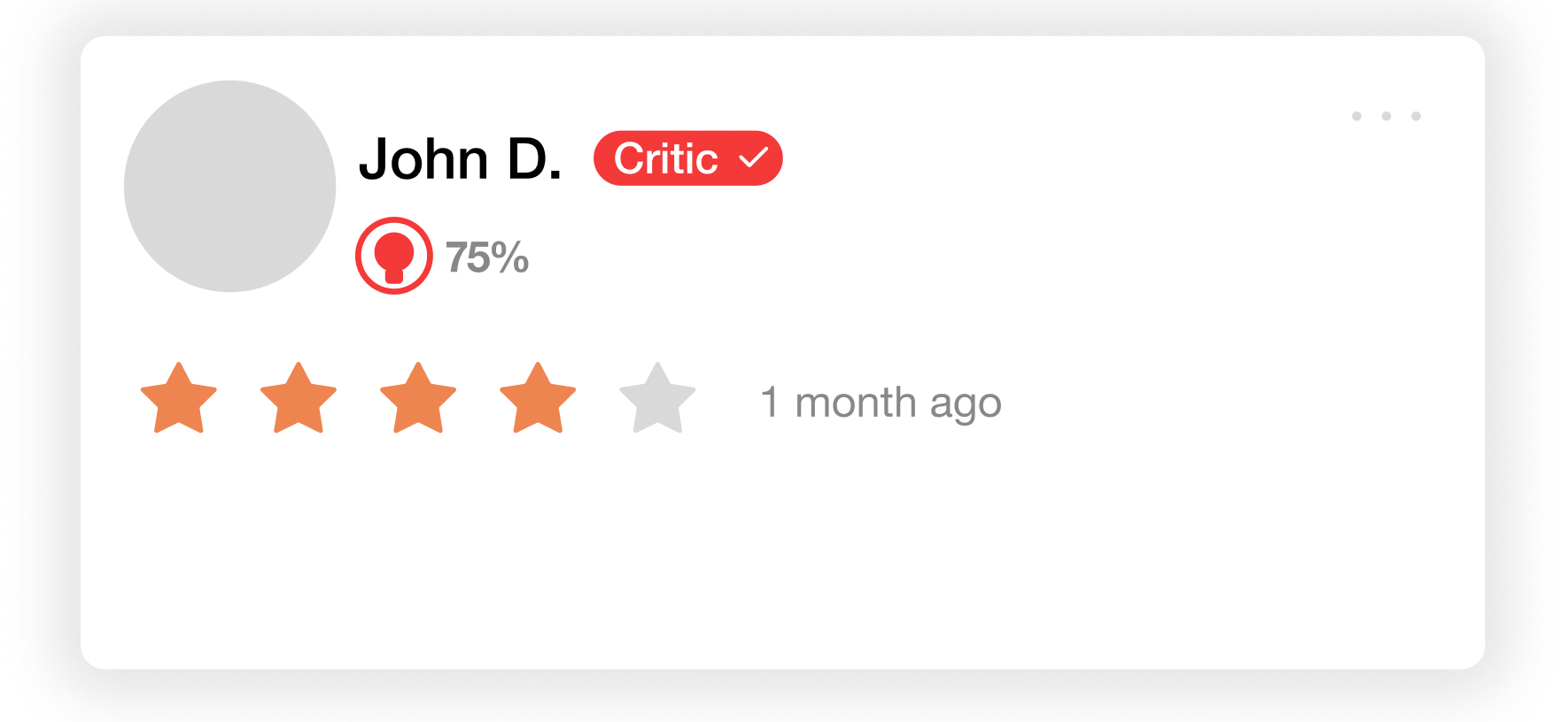
The next part to improve the browsing expereince is to seperate reviewers that offer useful reviews to the normal person checking in. To create this seperation, the designation of “critic” will be added to reviewers that have a greater than 75% useful rating on their reviews. This way, users that look at the reviews will have a quick way to identify which reviews will be more accurate to the expereince that they will have at the establishment. To create this “critic” designation a new critic icon will appear next to the reviwers’ account name. Also when sorting the reviews, there will be an option to sort only by critic reviews. This will replace the current “Elite” system that is not user curatted but more of a club of influencers with out much policing. With the new critic system, the “critic” will be held accountable for their reviews and ratings by other users and not by an abritrary council. Allowing for more tranparency and accountibility of those giving a review. Those with a critic designation can lose the designation if they give an overly harsh or biased review and don’t maintain thier 75% useful rating. Now when someone views a review they will be prompted to rate the review as useful or not. The reviewer will only have their useful rating display to the public to discourage intentionally giving a negative rating to the reviewer.
![]()
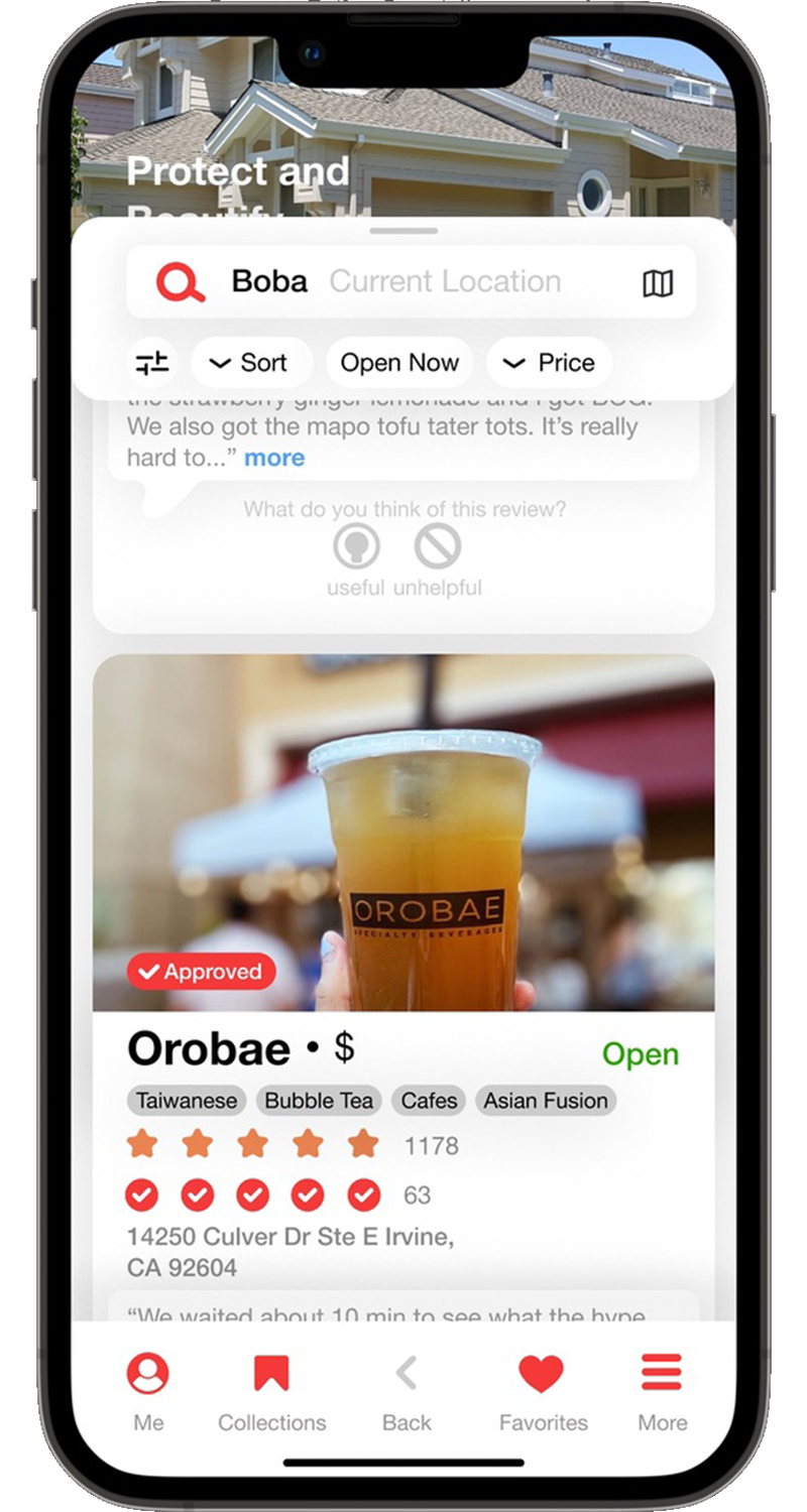
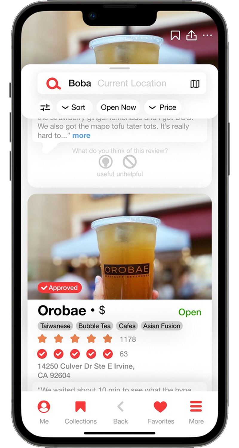
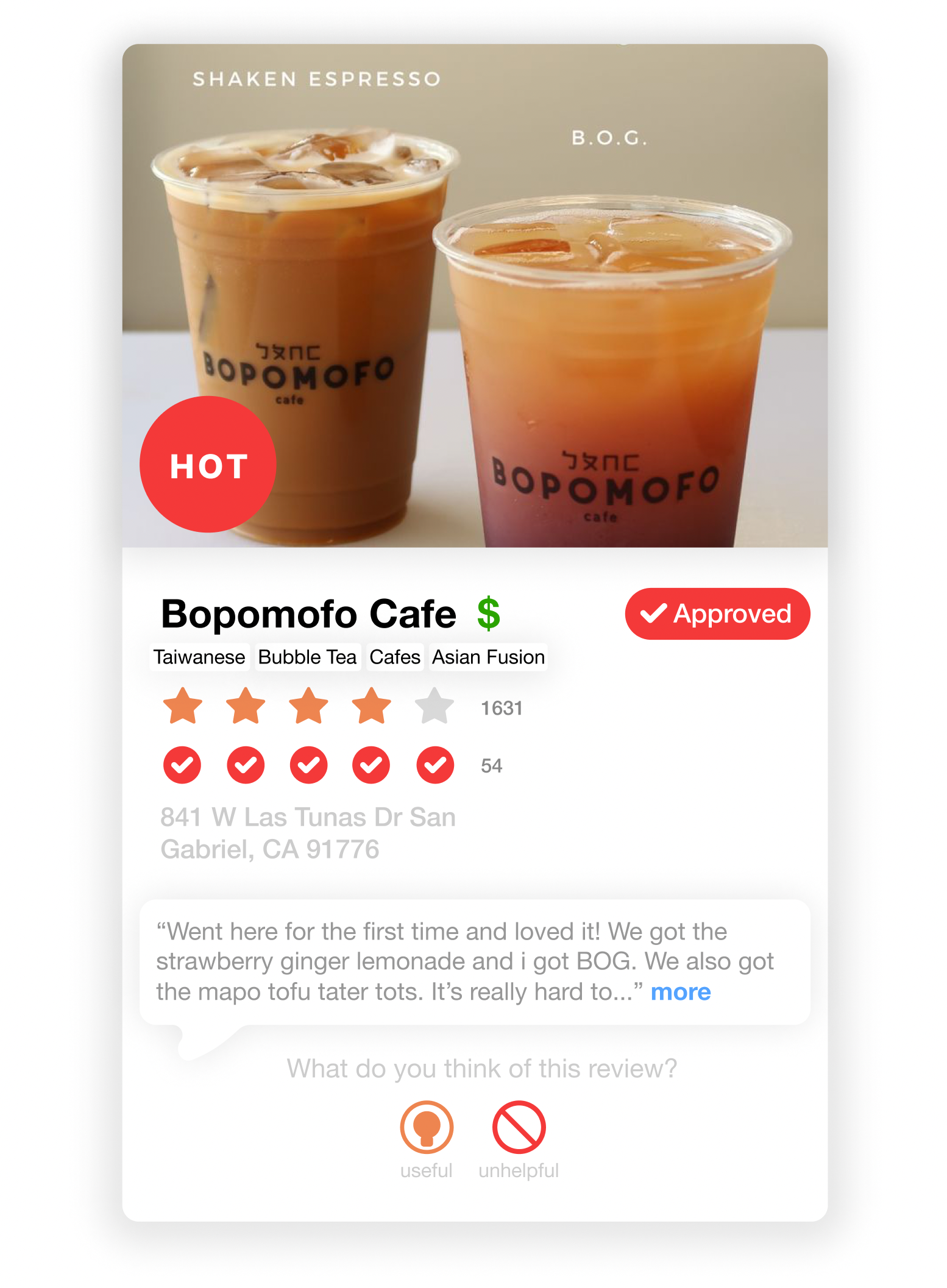
Cards are the essential element that allow users to view the information that crucial to making their decisons. Cards feature a primary image that are visaully rich and gives a good representaion of the establishment. Complementing the image would be information follwoing the heirarchy of importance that we extablished earlier. With minimal amounts of text and instead using mostly symbols and icons to represent common data points, allowing for a concise understanding with a quick glance. Also included on the cards are a snippit of the top rated review.
![]()
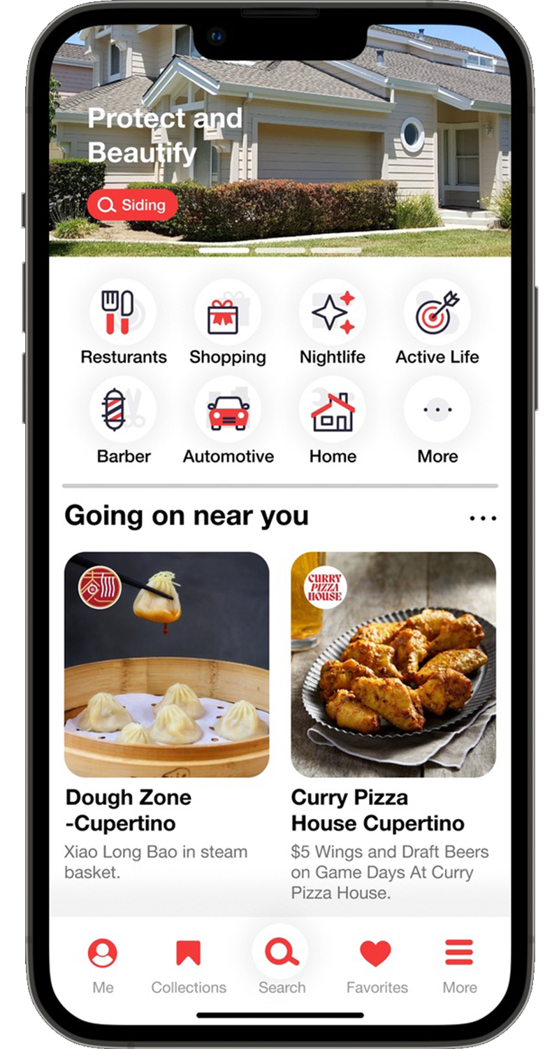
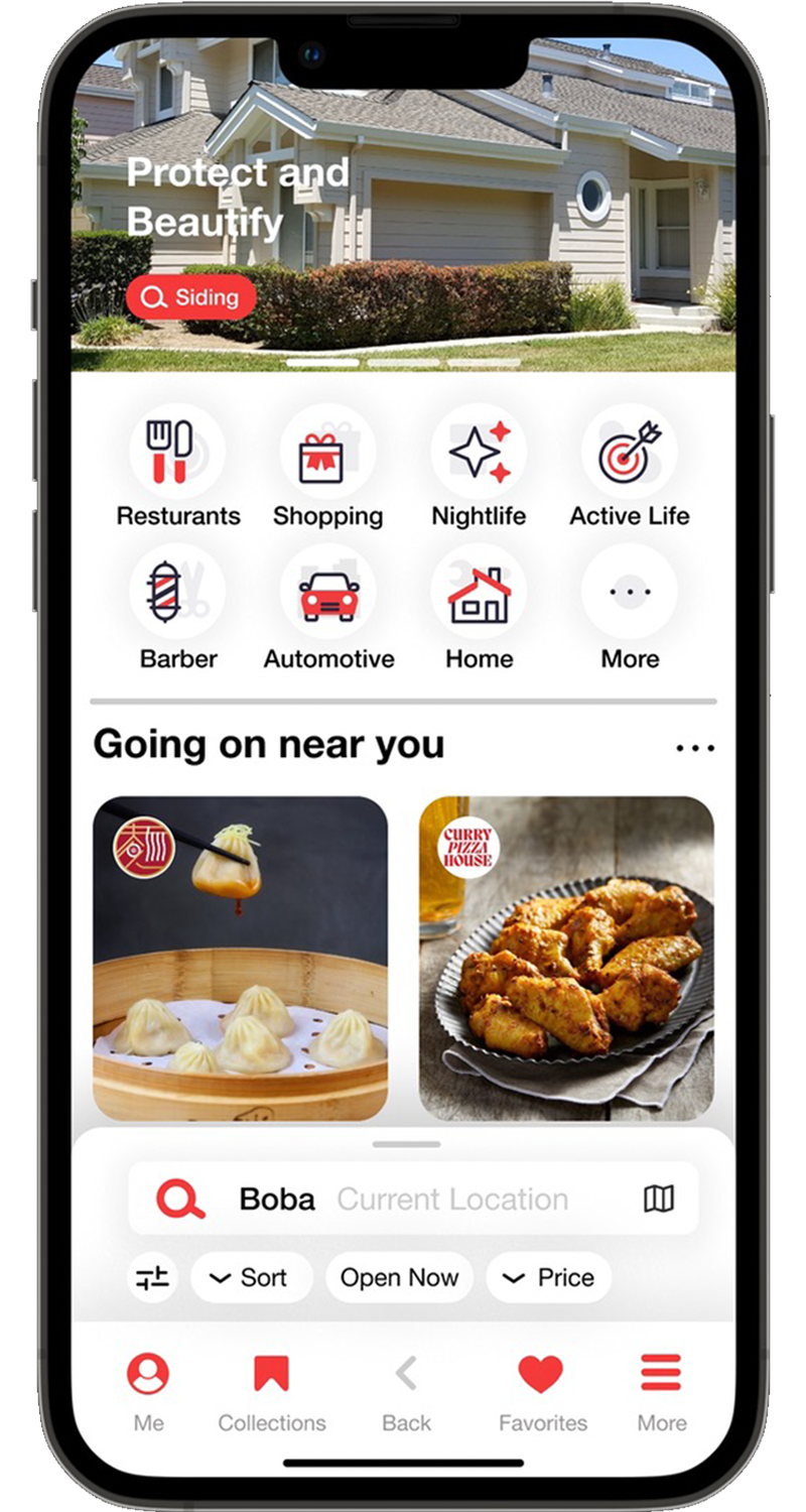
To highlight the search function and make it easier to access, the search icon is now placed in the center of the navigation bar to easliy be accessed with one hand. Making the process of searching for a place just one tap away.
![]()

The next part to improve the browsing expereince is to seperate reviewers that offer useful reviews to the normal person checking in. To create this seperation, the designation of “critic” will be added to reviewers that have a greater than 75% useful rating on their reviews. This way, users that look at the reviews will have a quick way to identify which reviews will be more accurate to the expereince that they will have at the establishment. To create this “critic” designation a new critic icon will appear next to the reviwers’ account name. Also when sorting the reviews, there will be an option to sort only by critic reviews. This will replace the current “Elite” system that is not user curatted but more of a club of influencers with out much policing. With the new critic system, the “critic” will be held accountable for their reviews and ratings by other users and not by an abritrary council. Allowing for more tranparency and accountibility of those giving a review. Those with a critic designation can lose the designation if they give an overly harsh or biased review and don’t maintain thier 75% useful rating. Now when someone views a review they will be prompted to rate the review as useful or not. The reviewer will only have their useful rating display to the public to discourage intentionally giving a negative rating to the reviewer.
Cards are the essential element that allow users to view the information that crucial to making their decisons. Cards feature a primary image that are visaully rich and gives a good representaion of the establishment. Complementing the image would be information follwoing the heirarchy of importance that we extablished earlier. With minimal amounts of text and instead using mostly symbols and icons to represent common data points, allowing for a concise understanding with a quick glance. Also included on the cards are a snippit of the top rated review.
To highlight the search function and make it easier to access, the search icon is now placed in the center of the navigation bar to easliy be accessed with one hand. Making the process of searching for a place just one tap away.

Wireframe
![]()

New Design
